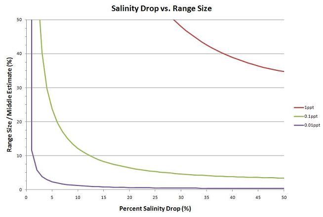
This graph shows how the size of the estimated volume range falls sharply as the percent salinity
drop increases. The purple line is for salinity measurements that are � 0.01ppt, the green line
is for salinity measurements that are � 0.1ppt, and the red line is for salinity measurements that
are � 1ppt.

|